Last year, I had a conversation with a senior business and data leader from one of the world’s most recognisable entertainment companies. I cannot name them or the organisation. But what they told me has stayed with me ever since.
Their goal: eliminate every dashboard in their analytics environment and replace it entirely with conversational analytics. Timeline: eighteen months.
I disagree with that goal. Completely.
Not because I’m resistant to AI. I spend most of my working life at the intersection of analytics and artificial intelligence, and I believe genuinely in what large language models can unlock when applied to data work. Conversational interfaces, LLM-assisted authoring, AI-generated narratives layered over data — these developments excite me. I’ll come back to them.
But replacing dashboards entirely? That is a mistake. And the reason is not about tooling preference or the usual resistance to change. It is about how the human brain actually works.
Before making that case, a concession: the frustration behind this goal is legitimate. Luzmo’s 2025 State of Dashboards report — which surveyed 200+ product leaders, data teams, and executives — found that despite 78% of organisations offering dashboards, users rated their analytics experience at just 3.6 out of 5. Nearly 40% said the data did not support decision-making sufficiently. There is no shortage of bad dashboards in the world. But that is an argument for designing them better — not for eliminating the medium.
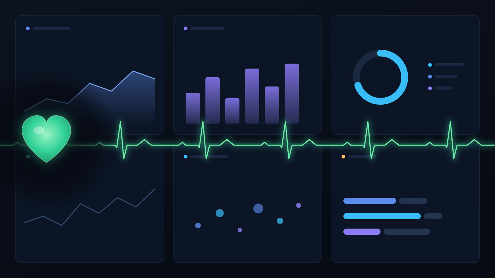
Your Brain Was Built for Visuals
Cognitive scientists have understood this for decades. The human visual system processes certain kinds of information — colour, shape, size, spatial position, direction of movement — before conscious thought kicks in. Researchers call this pre-attentive processing, and it operates in roughly 200 to 250 milliseconds. That is not figurative speed. Your brain has already registered a spike in a bar chart or an anomaly in a line graph before you have consciously decided to look for one.
Colin Ware, one of the foremost researchers in information visualisation, documented this extensively in Visual Thinking for Design. The practical implication is profound: a well-designed dashboard gives an experienced analyst or executive an enormous cognitive shortcut. They are not reading the chart. They are perceiving it. The insight registers before the question is fully formed.
Contrast this with text and tables. When data arrives as prose or rows and columns, you must read, parse, hold values in working memory, and compare them — sequentially. George Miller’s foundational 1956 paper established that working memory holds roughly seven items simultaneously, plus or minus two. Text is a serial medium. Visual displays, by design, sidestep that constraint entirely.
Psychologist Allan Paivio extended this further with his dual-coding theory. Paivio showed that the brain encodes information presented in both visual and verbal form into two separate cognitive channels, retaining it more effectively than information in either format alone. Lionel Standing’s foundational studies on the Picture Superiority Effect put empirical weight behind this: recognition memory for images approaches 90% accuracy after a day and a half — compared to roughly 62% for equivalent word lists. A dashboard with a chart and a headline insight does not just look better. It is processed and remembered differently to a paragraph of text saying the same thing.
This is not a design philosophy. It is a function of human neurology. And it does not change because we now have large language models.
What Conversational Analytics Gets Right — and What It Doesn’t
There is a genuine case for conversational analytics — let me make it.
It democratises data access in a way that dashboards have historically failed to do. A business user who doesn’t know SQL can ask a natural language question and receive a meaningful answer in seconds. That is genuinely valuable — for exploratory analysis, one-off queries, and situations where nobody has built a formal dashboard. It lowers the barrier to insight for a far wider audience. I have no argument with any of that.
But conversational analytics has a problem that rarely gets discussed directly: you can lose what you found.
In 2026, researchers Ken Gu, Srishti Palani, and Vidya Setlur published a paper at CHI 2026 titled “I Need to Find That One Chart.” The finding is disarmingly straightforward: data workers conducting extended AI conversations over data cannot easily navigate back to specific insights or charts buried in the conversation history. Current tools provide no meaningful infrastructure for search, navigation, or sense-making of conversation history. The more you interact with an AI over data, the harder it becomes to recover what you actually discovered.
The researchers call this conversational debt. It grows with every session.
I have seen versions of this play out firsthand. Organisations that move toward conversational-first analytics typically experience the same arc: early enthusiasm, genuine democratisation for non-technical users, growing confidence that the old dashboard estate is being superseded. Then, months in, the questions surface. Where is the analysis from last month? Why does the number in the meeting differ from the one in the chat thread? What was the context behind that anomaly in Q3? Insights that live in a dashboard are findable, shareable, and permanent. Insights that live in a conversation are none of those things.
“As analytical work becomes more dialogue-driven, helping people recover, revisit, and build upon prior insights will become just as important as generating new ones.” – Vidya Setlur, Senior Director, Research, Tableau
A dashboard does not have this problem. The spike you noticed last Tuesday is still there. Your colleague sees exactly what you see. The anomaly has not disappeared into a thread.
There is a structural issue too. Conversational analytics is inherently a one-question-at-a-time interface. You ask, you receive, you ask again. A well-designed dashboard, by contrast, puts multiple related metrics in the same field of view simultaneously — precisely so you can perceive the relationships between them. That is the point of a dashboard. Not to deliver data on request, but to enable comparison at a glance.
Asking an AI “what was revenue last quarter?” and then “what was cost of acquisition?” and then “how does that compare year-on-year?” is a dramatically inferior experience to a dashboard that surfaces all three simultaneously, lets you see the trends in parallel, and lets your pre-attentive visual system do the work it was built for.
What the Research Actually Says About Where This Is Heading
Here is what I find genuinely compelling about the research coming out of applied analytics teams over the last twelve months: the best minds in this field are not betting on a future without dashboards. They are betting on a future where dashboards are more capable — because AI handles the parts that dashboards have historically done poorly.
Take DataWeaver, published at EuroVis 2025. It is a bidirectional text-and-visualisation composition system. Authors can start from a chart and have an LLM write the narrative explanation. Or start from text and have it recommend an appropriate visualisation. The chart and the text reference each other dynamically.
This is not a replacement for dashboards. It is a direct solution to one of the most consistent weaknesses in dashboard design: charts sitting in silence, with no contextual explanation for readers who lack the background to interpret them.
A different angle comes from DashGuide, also at EuroVis 2025. Authors interact with a live dashboard; GPT-4 generates a guided tour — step-by-step instructions walking viewers through the key insights in sequence. In testing, 72% of the auto-generated tour steps required no editing by the human author. Not a replacement. An augmentation. AI handling the authoring scaffolding work that previously had to be done manually — if it got done at all.
Plume (CHI 2025) goes further, scaffolding text composition directly inside dashboards with configurable levels of automation, giving authors control over how much the AI contributes versus how much the human writes.
And when researchers conducted a large-scale empirical study of 25,000 real-world Tableau dashboards — published in December 2025 — they were not analysing historical artefacts. They were looking at dashboards being built and used at scale right now, using that data to ground future design decisions.
The signal underneath all of this research is consistent: dashboards aren’t being replaced by AI — they’re being augmented by a layer of intelligent authoring and narration tools built on top of them.
“The future increasingly feels less like dashboards or analytical conversations, and more like dashboards with conversational and agentic capabilities layered on top. Many of the systems emerging from research and industry are converging toward hybrid experiences where visualizations provide persistent, shareable analytical state, while conversational interfaces support exploration, explanation, and refinement.” – Vidya Setlur, Senior Director, Research, Tableau
What This Means if You’re Making Decisions Today
If you are a business or data leader planning your analytics strategy, the evidence points in one direction more clearly than any other: invest in dashboard quality — not less, but more.
The pre-attentive advantage of well-designed visualisations is a durable feature of human cognition. AI does not eliminate it; it amplifies the gap between good and poor design. A poorly designed dashboard is worse than a conversational query. A well-designed one is faster, more memorable, and easier to share with colleagues than any chat transcript.
Conversational analytics belongs in your toolkit — particularly for ad-hoc queries, exploratory analysis, and broadening access for non-technical users. But treat it as a complement, not a destination. The two surfaces solve different problems. The interesting strategic question is not “dashboard or chat?” It is: how do these two surfaces reinforce each other in the same environment?
That question matters because the work appearing in venues like CHI and EuroVis is not incremental. It is a fundamental reimagining of how visual, textual, and AI layers interact in an analytics product. Organisations that understand this first will build significantly better experiences. And as AI generates more analytical content, the skills behind good dashboard design — structuring information visually for a specific audience, building hierarchy into data — become rarer and more important, not less.
My View — and an Invitation to Disagree
The conversation I described at the start is not an isolated one. I hear versions of this goal — replacing dashboards with conversational interfaces — with increasing frequency. I understand the appeal. Conversational interfaces feel modern. They feel like the future.
But “feels like the future” is not a design philosophy. It is a heuristic with a poor track record.
The human brain’s preference for well-designed visual information is not a legacy habit that will be trained out of us as AI becomes more familiar. It is structural. Pre-attentive processing is not a preference. It is a feature of the visual cortex that was in place long before the first bar chart was drawn, and will remain long after the last one is debated.
Dashboards — good ones, designed according to principles that respect how people actually perceive and process information — will be relevant for as long as humans are making decisions from data. The most exciting work in the field right now is not replacing them. It is making them dramatically better.
I hold this view with genuine conviction. But I’m not certain I’m right.
If you believe the conversational-first future is correct, I want to understand why. If the neuroscience argument seems overstated, or the research I’ve cited doesn’t mean what I think it means, tell me. If you work in an organisation that has moved decisively toward conversational analytics and you have data on how it is working — I am genuinely interested.
Leave a comment. Push back. Disagree with everything I’ve written if you feel so inclined.
The best outcome from publishing this is not agreement. It is an intelligent conversation with people who have thought carefully about this and arrived somewhere different.
For more research and ideas, see https://www.tableau.com/research
